How to Make Corporate Event Decor Reflect Your Brand
Walk into most corporate events & the branding shows up in exactly one place, a vinyl step-and-repeat by check-in with the logo tiled across it like wallpaper. Everything else in the room, the linens, the uplighting, the stage, could belong to any company that rented the same ballroom the week before.
Corporate event decor reads as on-brand when the room carries the company's real colors & one distinctive structural choice, not when a logo gets printed onto rental furniture. Brand color washed across an entrance or a stage wall, one built element that couldn't belong to another company's event, does more to say this is us than the same logo repeated forty times on linens & lanyards.
The logo isn't the brand
The most common mistake is confusing branding with logo placement, not skipping branding altogether. Cubex's event branding research makes the distinction directly. A logo is part of the brand experience, not the whole of it. Print it on every surface without a concept behind it & a room starts to feel repetitive & visually heavy instead of intentional. The planners who get this right treat the logo as one signal among several, not the entire strategy.
The backdrop mistake that makes a room feel generic
The backdrop usually gets briefed last & produced fastest, which is exactly why it's the piece most likely to give a room away. Paper Carpenter's breakdown of event backdrops calls out treating the backdrop as an afterthought as the most common mistake in corporate event design. It ends up looking like every other step-and-repeat banner or vinyl pull-up in the industry, formats that became the default because they're cheap & fast, with the visual cost showing up in every photo from the event.
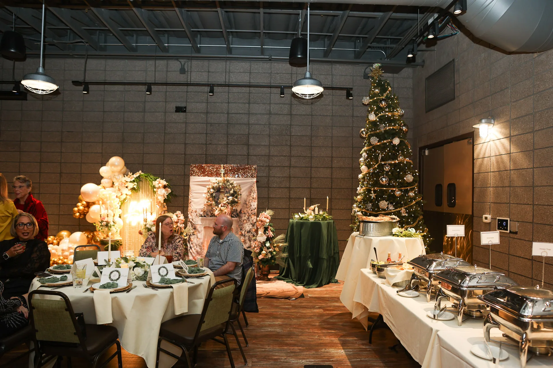
A backdrop built around the event's own colors, a custom shape instead of a rectangle, materials that catch light differently than vinyl, costs more than a generic banner but reads as considered instead of rented. Guests photograph it. The company's name travels in every one of those photos looking like it belongs there.
Where brand actually shows up in a room
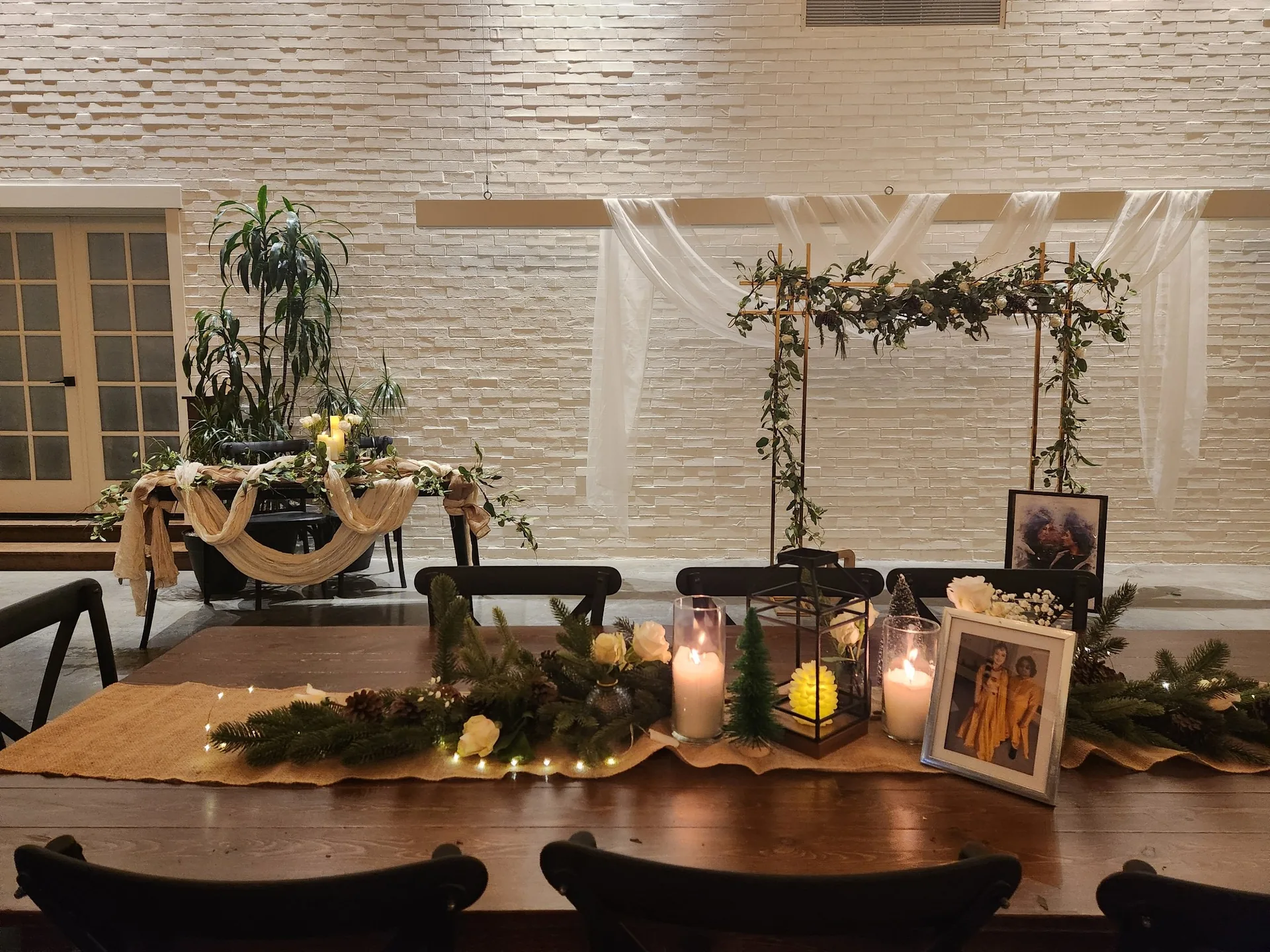
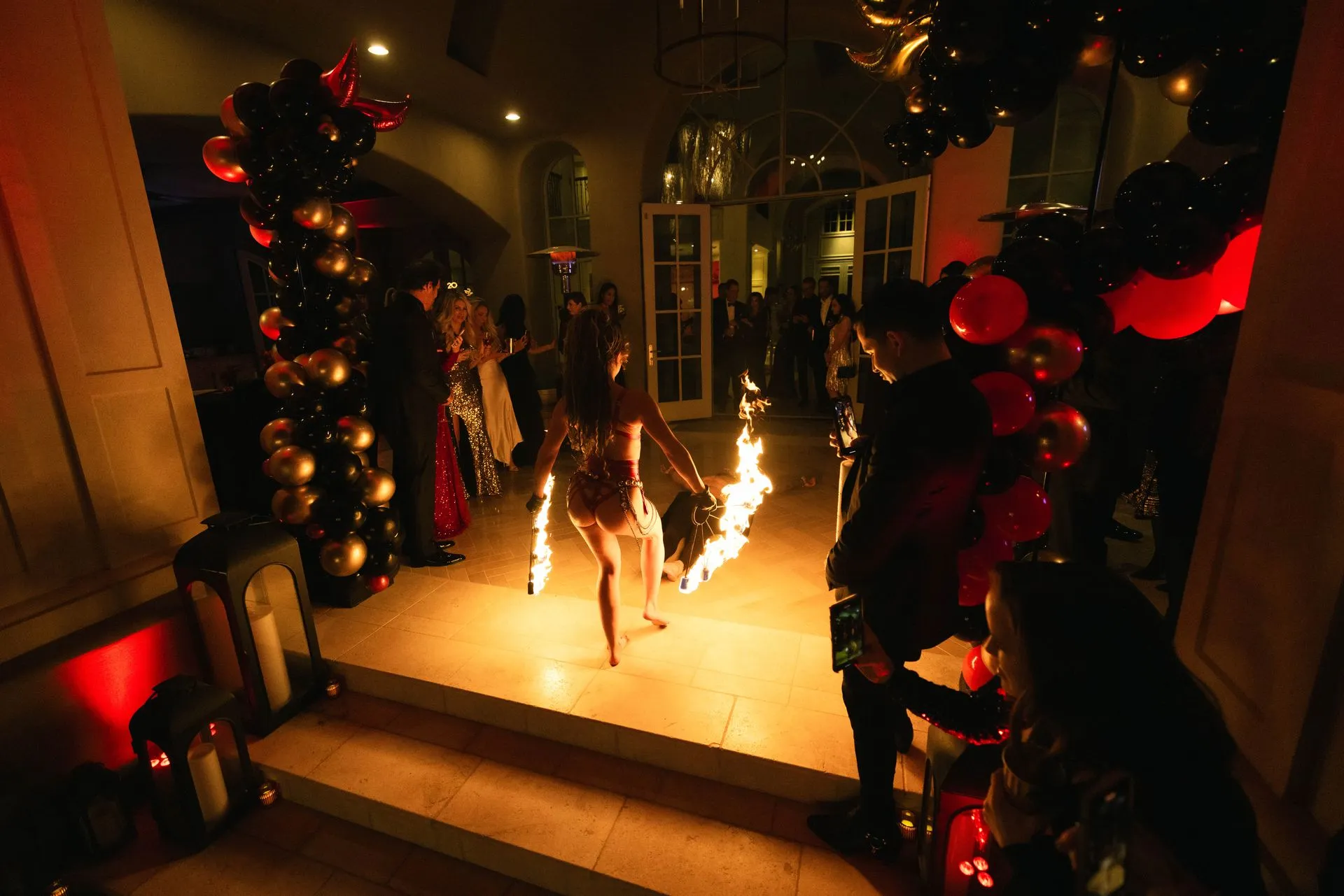
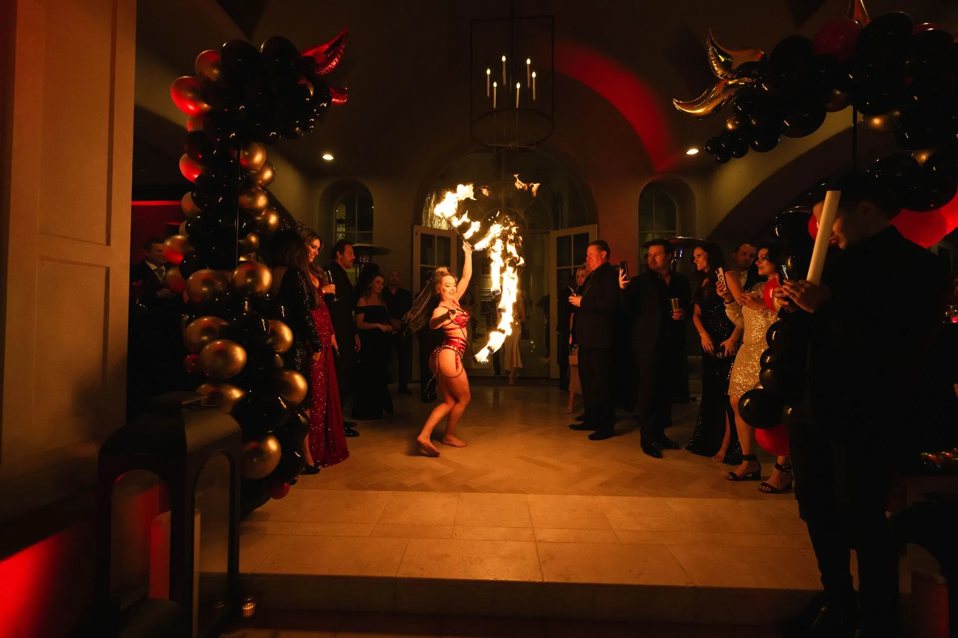
Three places carry more branding weight than the rest of the room combined: the entrance, the stage & the ambient light. White Massif's guide to event branding treats the entrance as an immersive brand statement in its own right, since guests form their first impression inside the first sixty seconds of walking in. A custom entry arch built in the company's actual colors does more in that window than any signage further into the room.
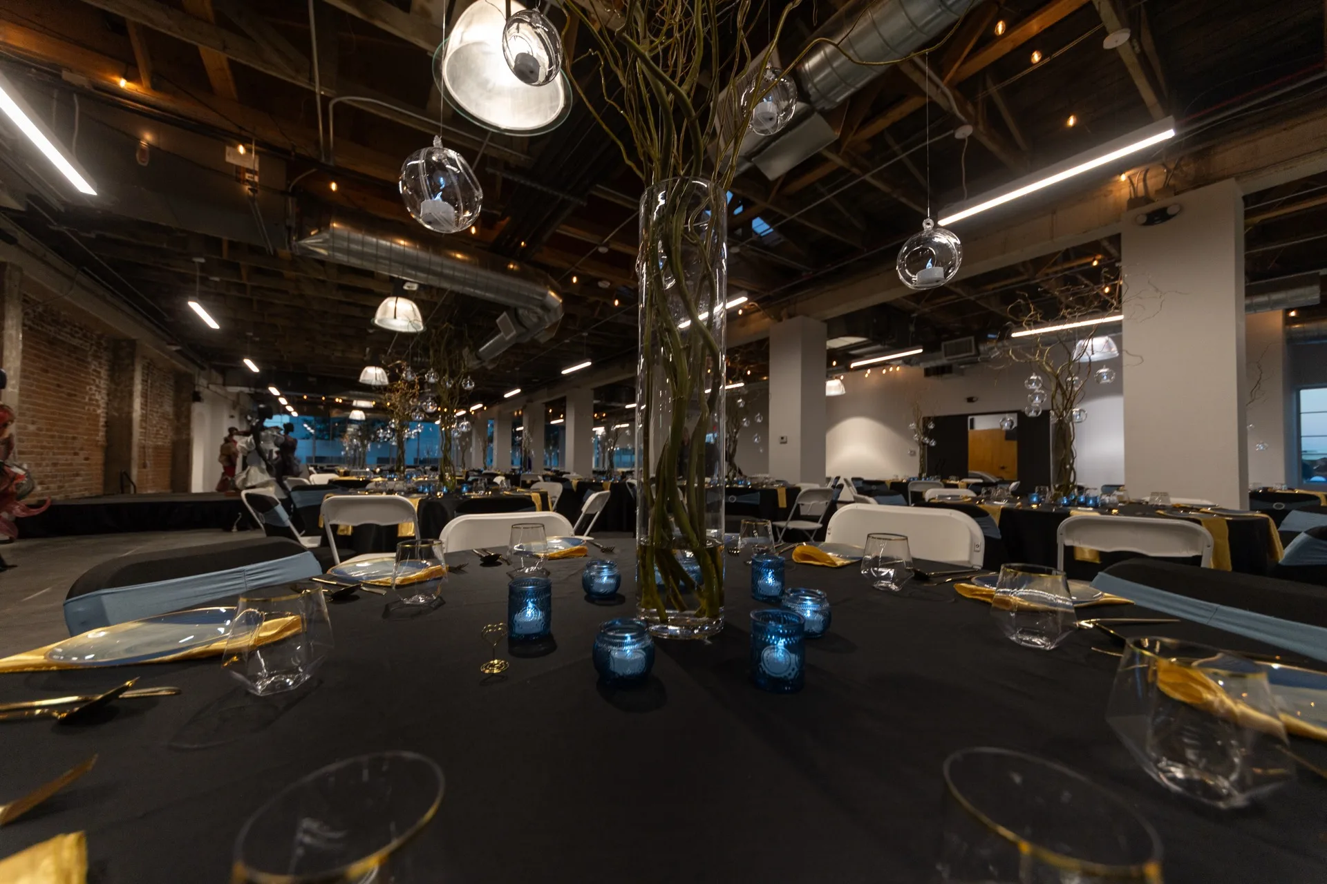
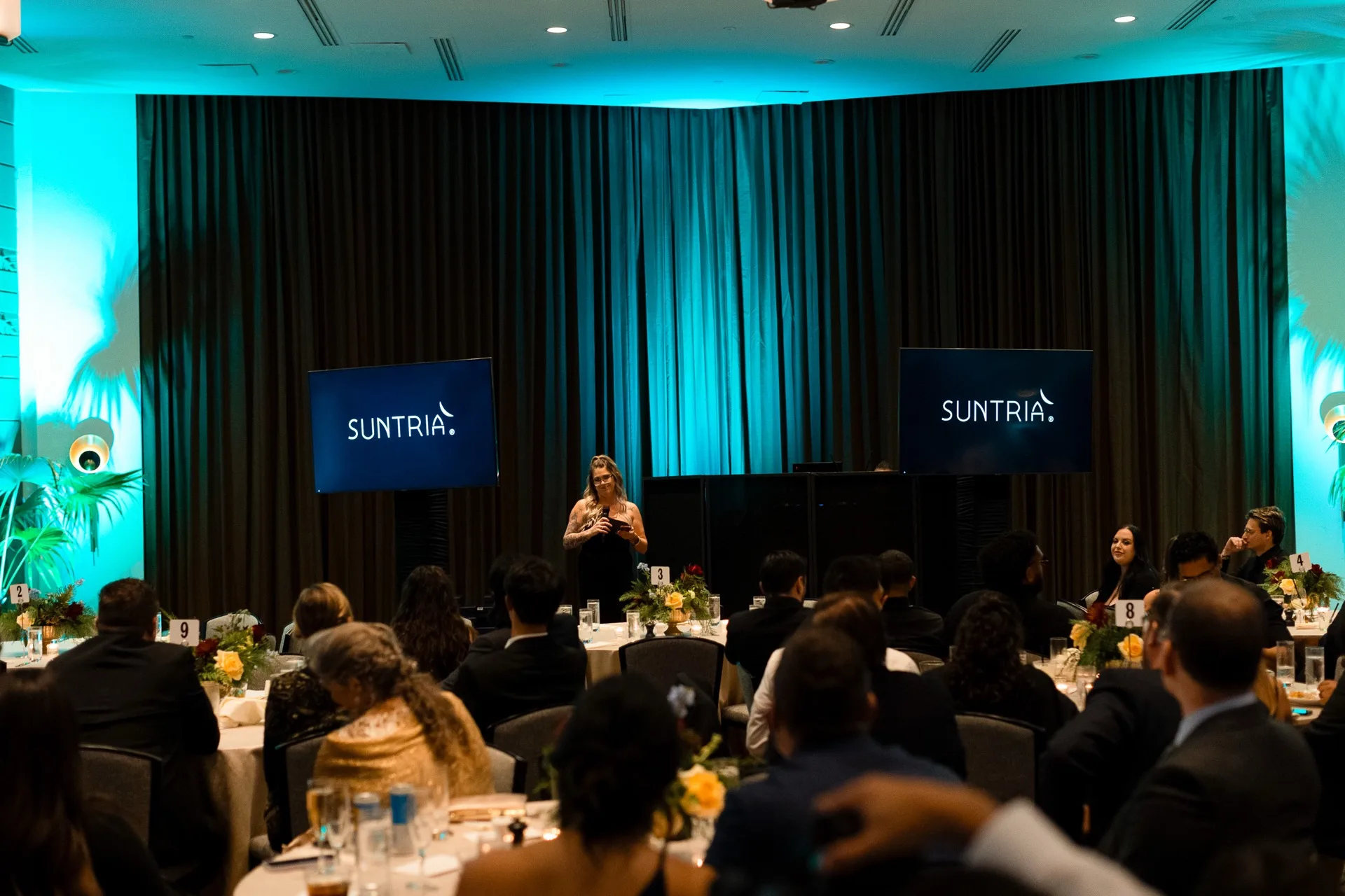
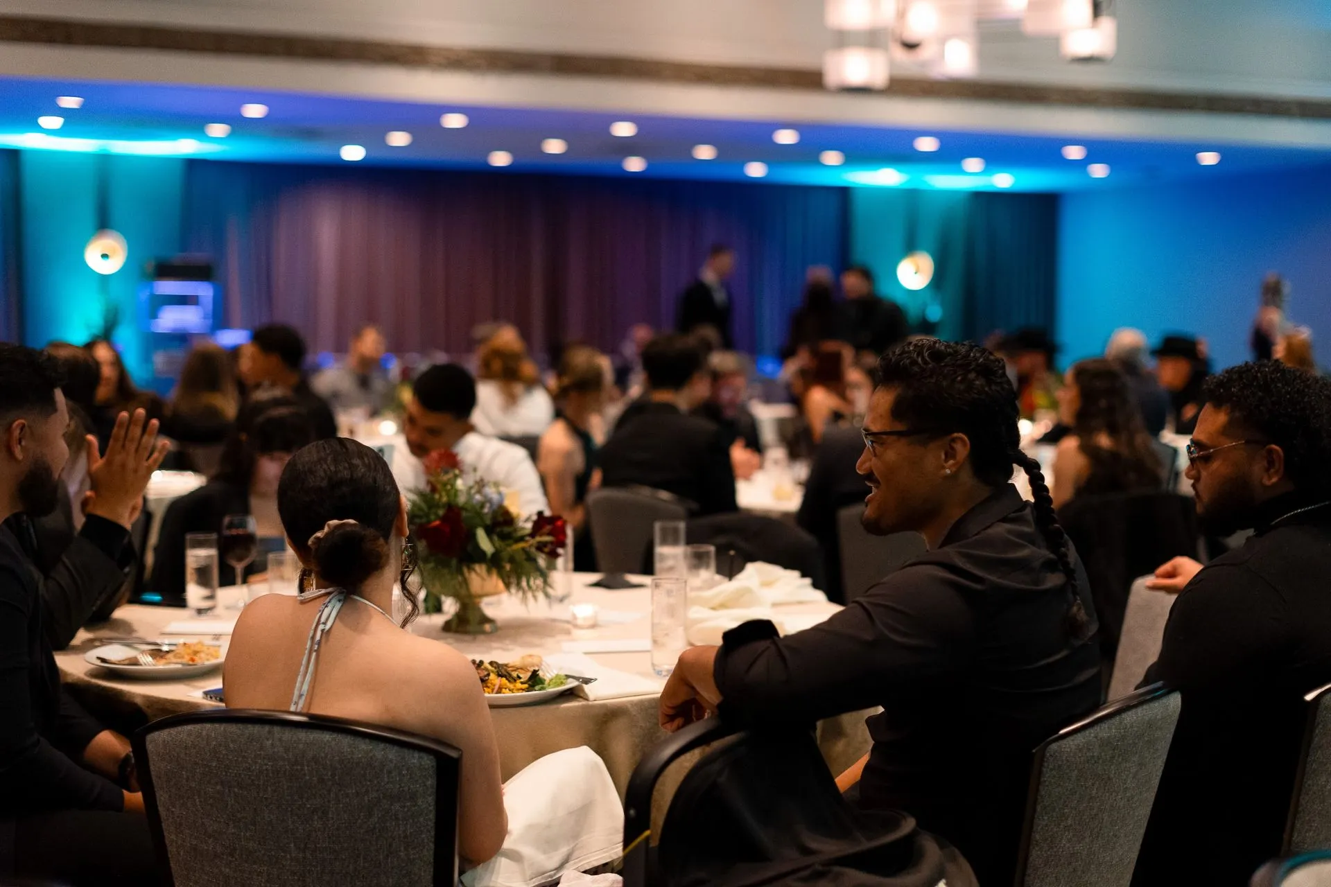
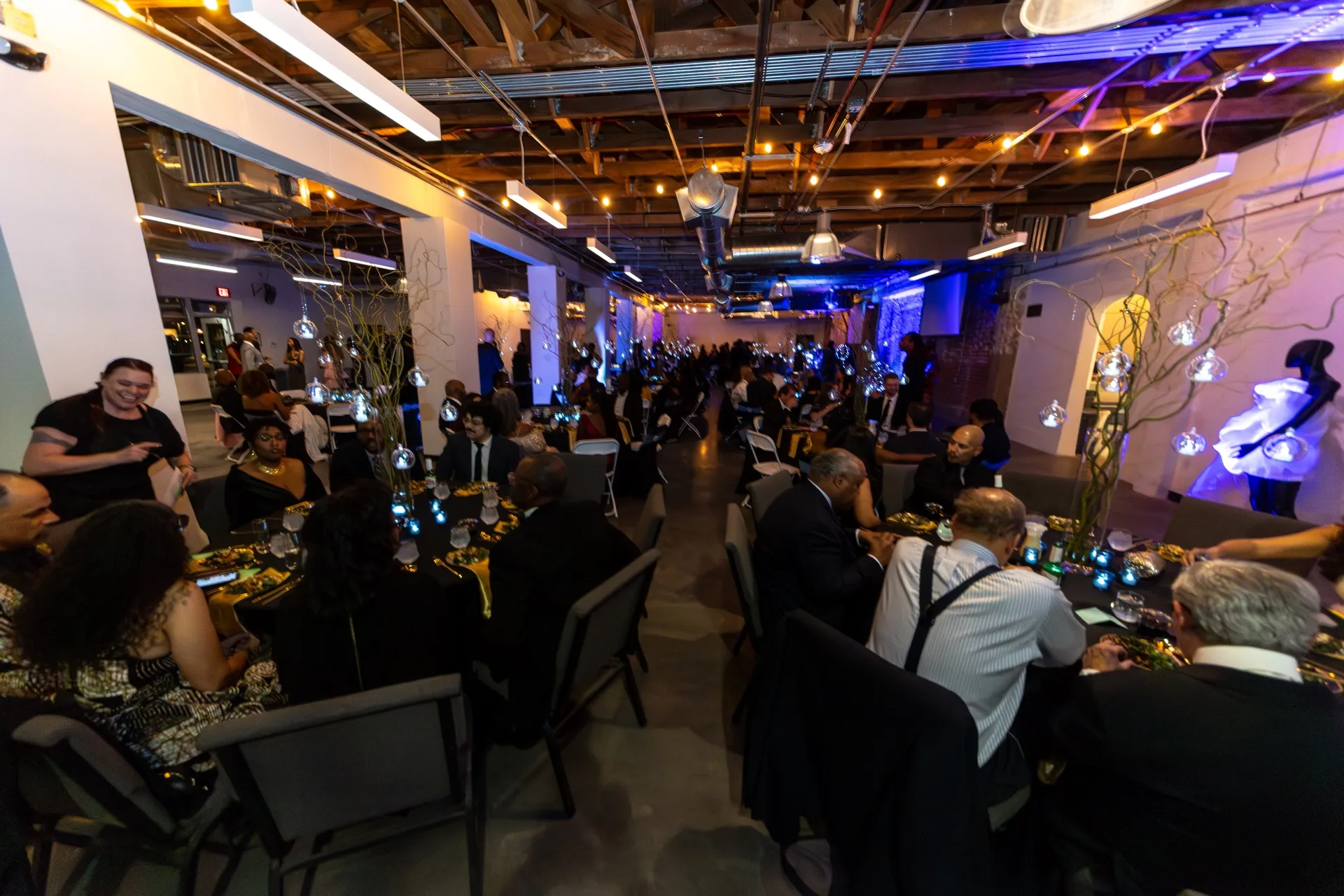
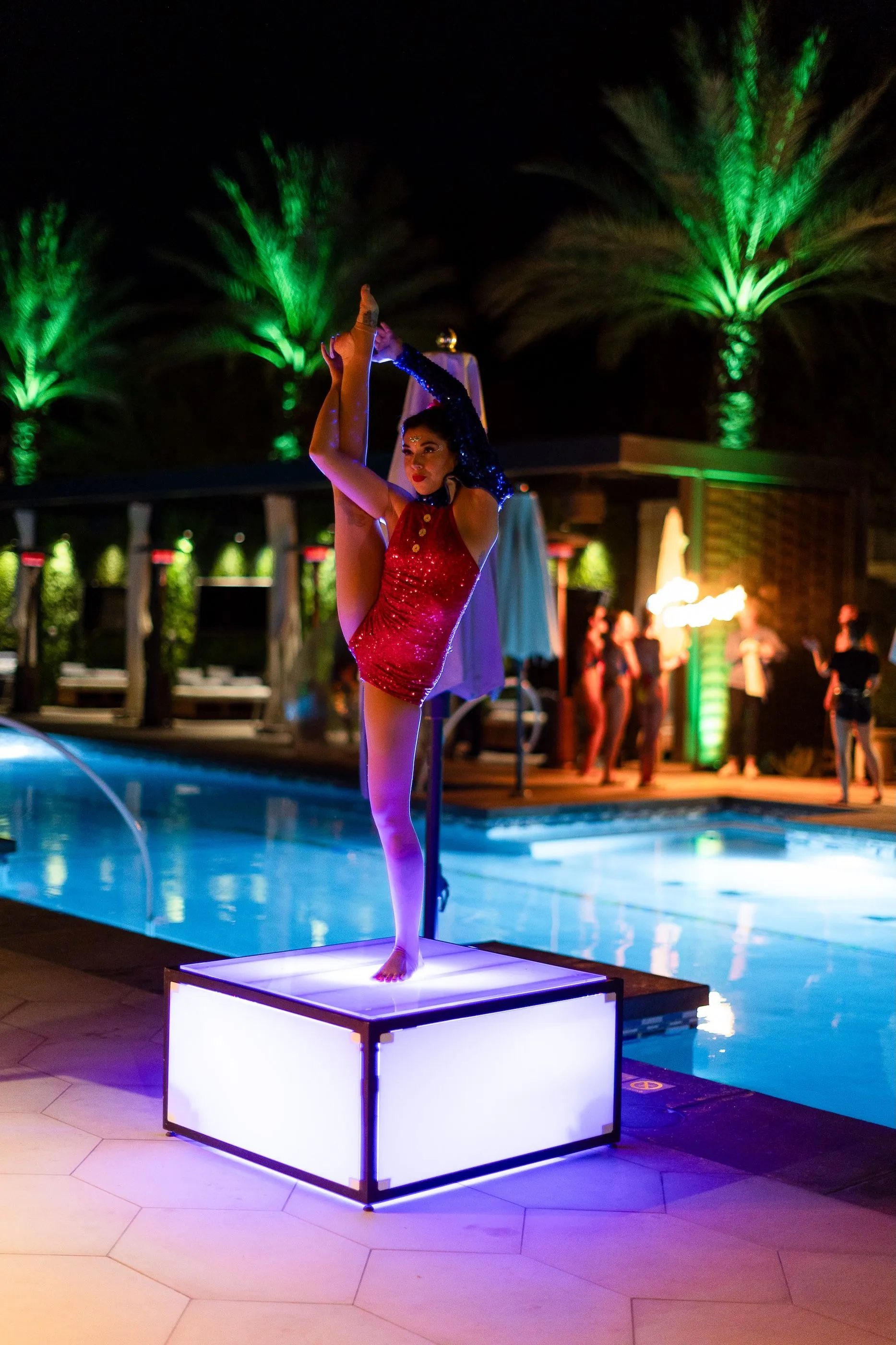
The stage is the second lever & the guide is blunt about the default. A black curtain & a projector screen wastes the most visible real estate in the building. The fix isn't complicated, custom set pieces, branded graphics, a wall that couldn't be swapped in for any other company's event. The third lever costs the least & changes the most: ambient light washed across the walls, ceiling, or floor in a color the brand actually owns. It's the fastest way to make a rented room feel like it was built for this one.
You don't need a custom build to get there
None of this requires building furniture from scratch. Quest Events' guide to branding with rentals makes the case that rentals have moved from a functional necessity to an actual branding tool & that customizing a rental piece, the right color, a printed panel, a graphic wrap, turns a generic structure into one that reads as built for the event. A rented arch in the brand's colors with one custom graphic panel does most of what a fully custom build does, at a fraction of the lead time & cost.
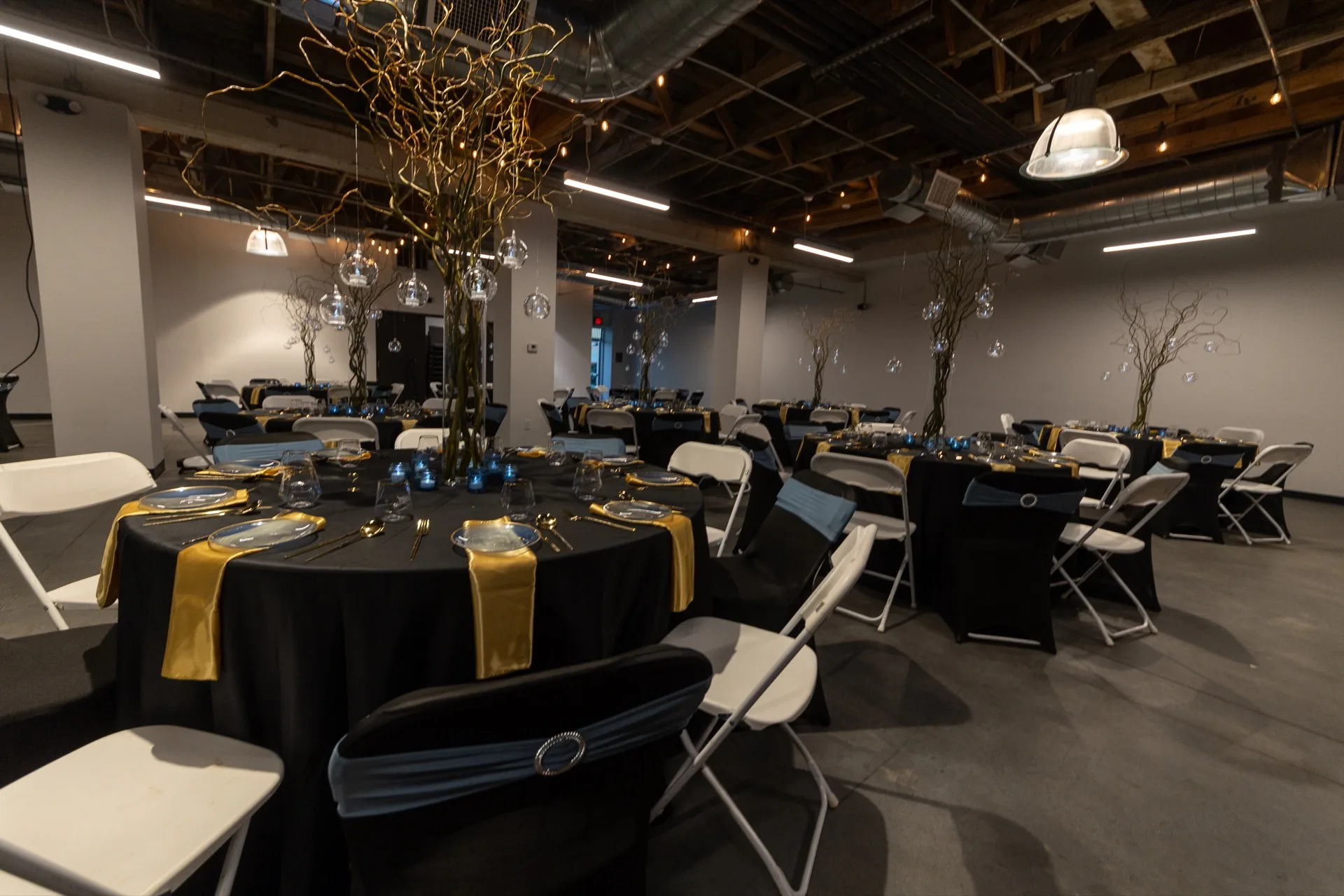
This is the same thinking behind how we approach lighting & decor on a Hana event: figure out which two or three elements actually carry the brand & put the budget & customization there instead of spreading a little branding thin across everything in the room. We've written before about where decor budget earns the most & branding follows the same logic. Concentrate it where guests actually look.
If the room at your last event could belong to any company that rented it the week before, that's fixable before the next one goes on the calendar. Tell us what your brand needs to say in the room & we'll map out where it goes. Start the conversation here.
Questions planners ask us
How do I make corporate event decor look like our brand?
Use the brand's actual colors in the biggest visual elements, the entrance, the stage backdrop & the ambient lighting, instead of relying on a logo printed everywhere. One built or customized element that couldn't belong to another company's event does more than a logo repeated across every surface.
Is putting our logo on everything enough to brand an event?
Not on its own. A logo is one part of the brand experience, not the whole of it. Printed on every surface without a concept behind it, a logo makes a room feel repetitive & heavy instead of intentional. Strong branding balances the logo with color, lighting & one distinctive structural choice.
Do we need custom-built decor to make an event feel branded?
Not usually. Most companies get there with well-customized rentals. A rented arch or backdrop in the right colors with one custom graphic panel does most of what a full custom build does, at a fraction of the cost & lead time. Save custom fabrication for the one element that genuinely has to be exact.
Where should brand colors show up first in event decor?
The entrance, the stage & the ambient lighting, in that order. Guests form their first impression inside the first sixty seconds of walking in, so the entrance carries the most weight. Lighting washed in the brand's color across the walls or ceiling is the fastest, least expensive way to extend that color through the rest of the room.
Photo: Your Media Guy (instagram.com/your_media_guy)
New posts, straight to your inbox.
Real lessons from real corporate events, no filler.





-1920w.jpg)

-1920w.jpg)