Why Your Corporate Event Decor Looks Like a Wedding (And How to Fix It)
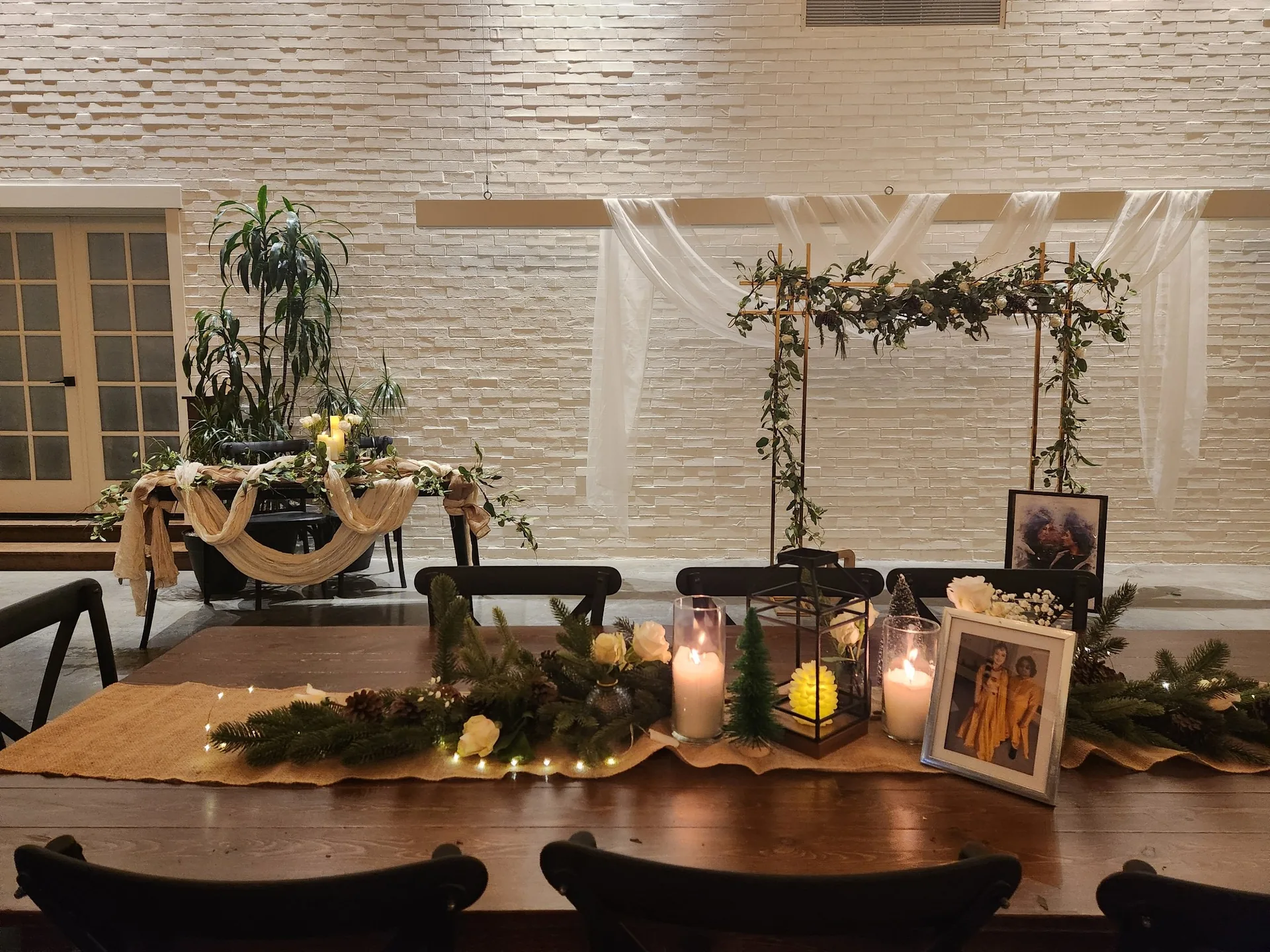
Picture the room: the florals are lush, the linens are pressed, the candles are burning low, & everything looks finished. Then someone from the executive team walks in & asks, only half joking, whose wedding this is. The planner who spent three months on it would feel the floor drop a little, because nothing about the decor was wrong exactly. It was built for the wrong occasion.
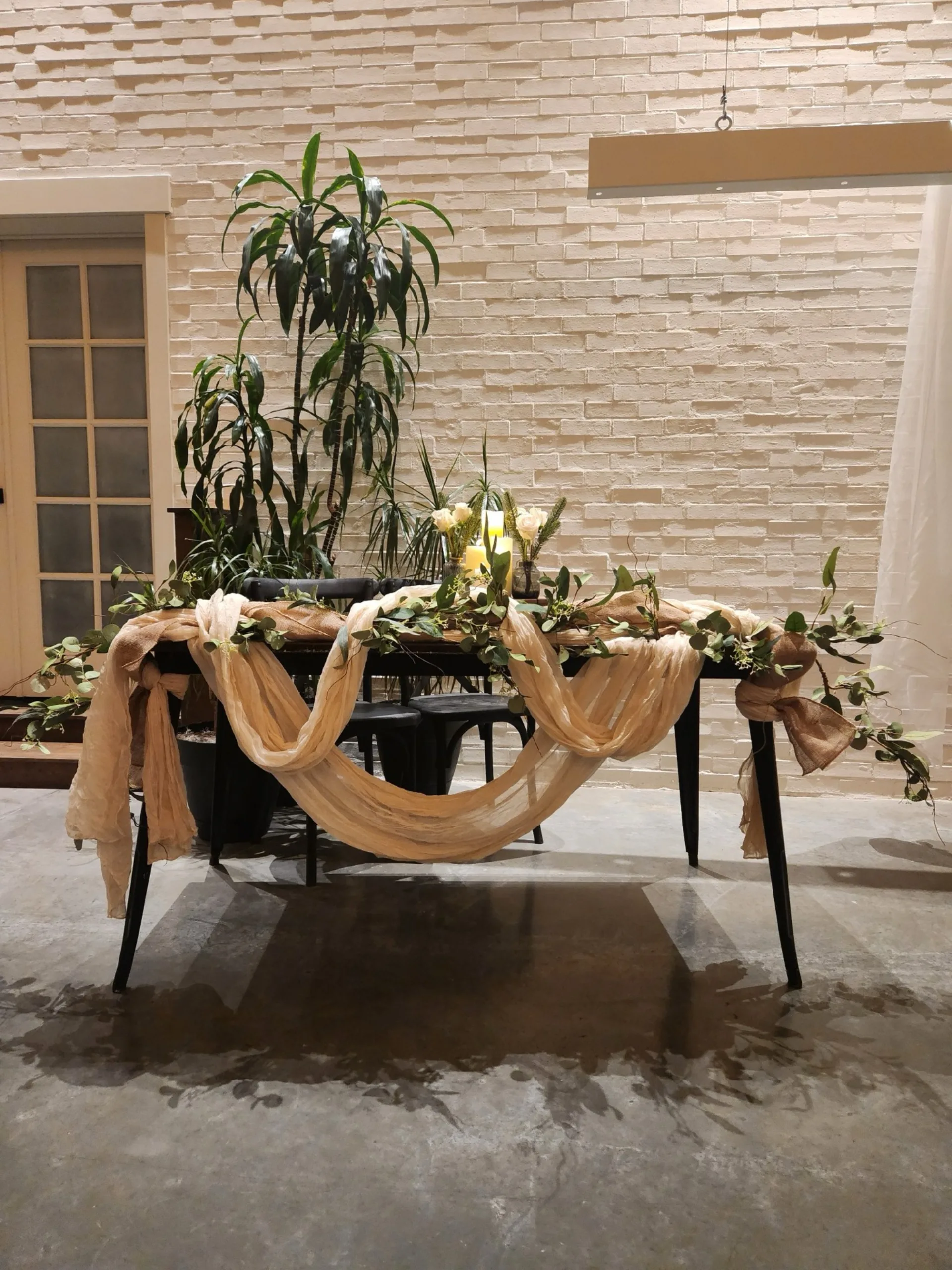
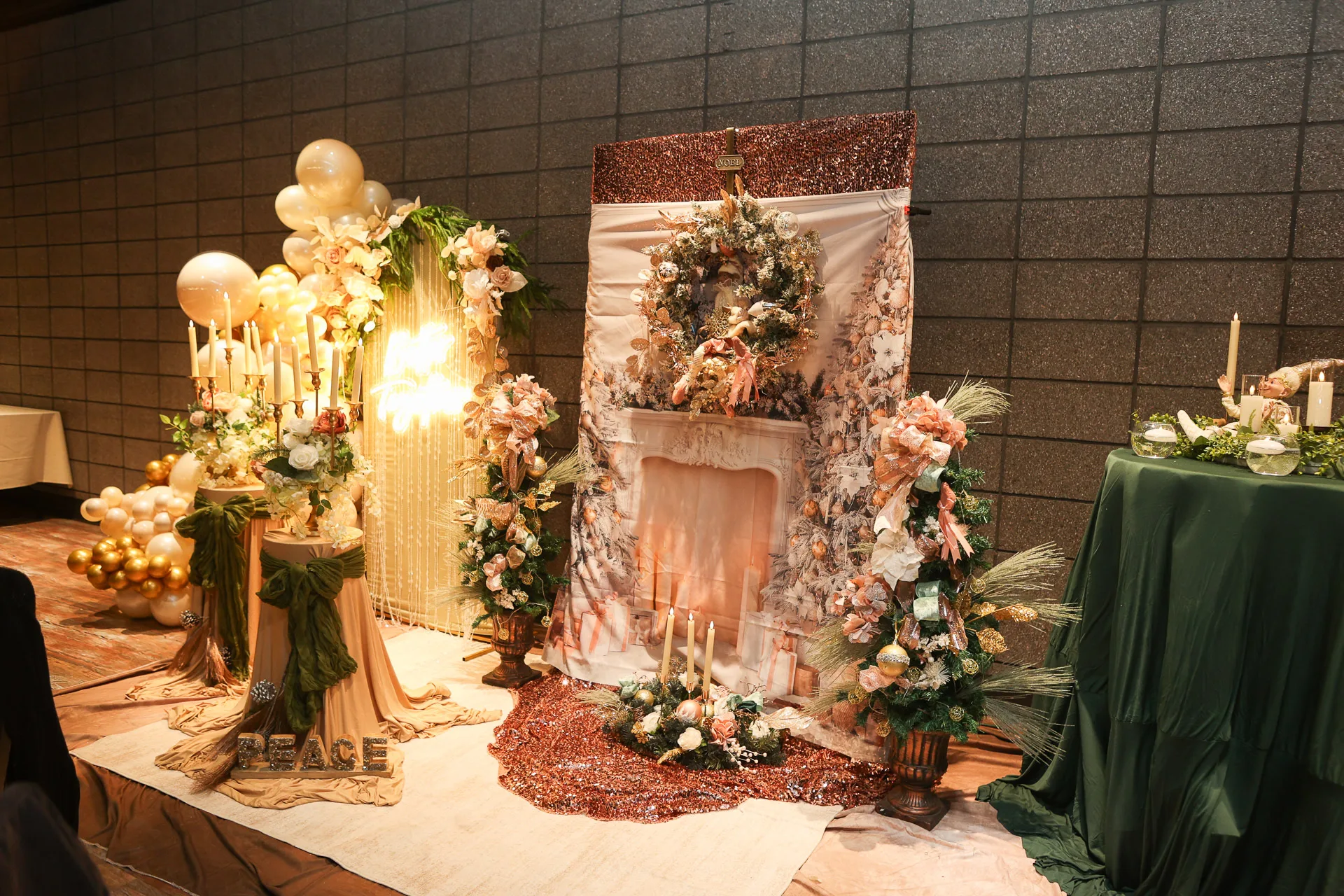
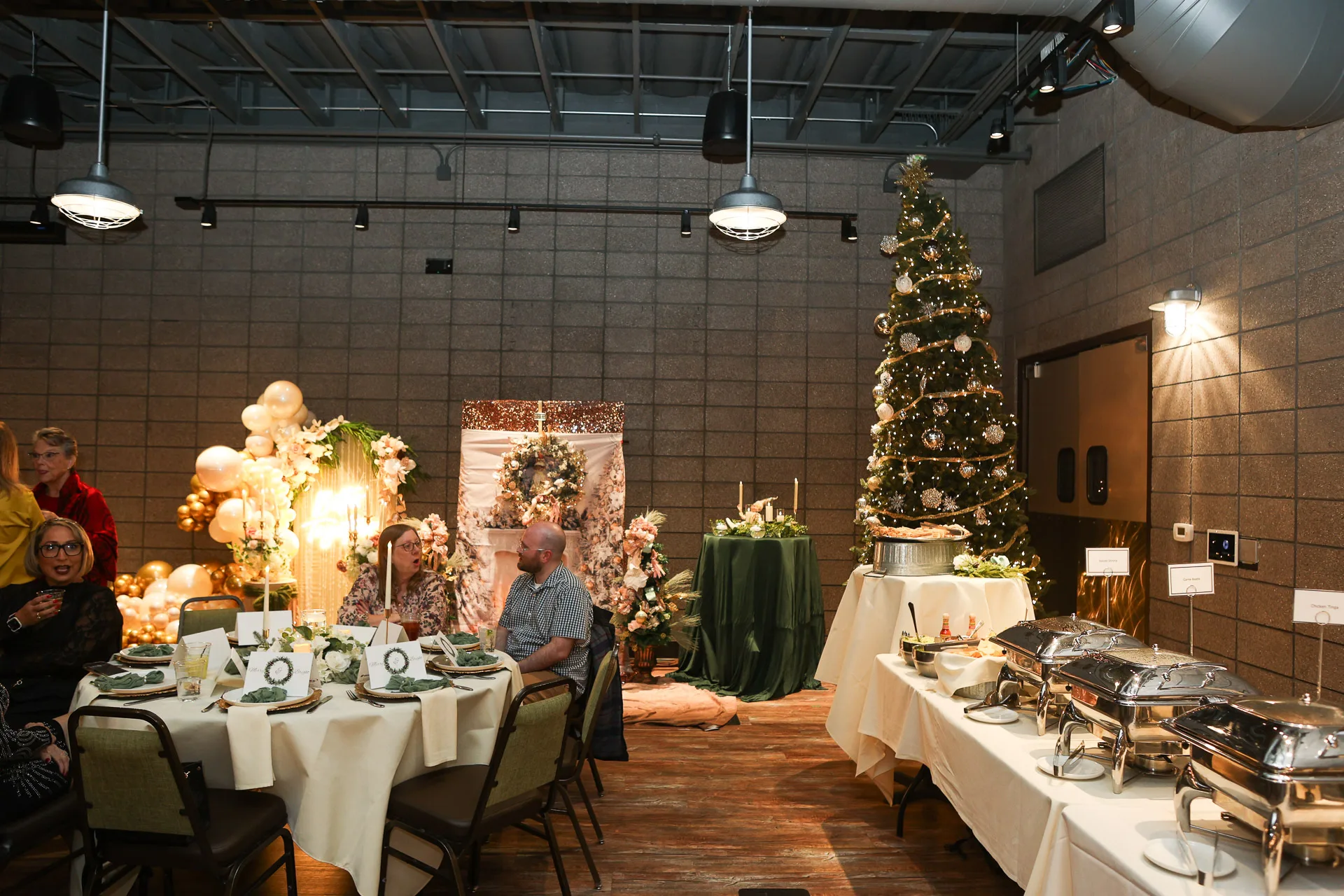
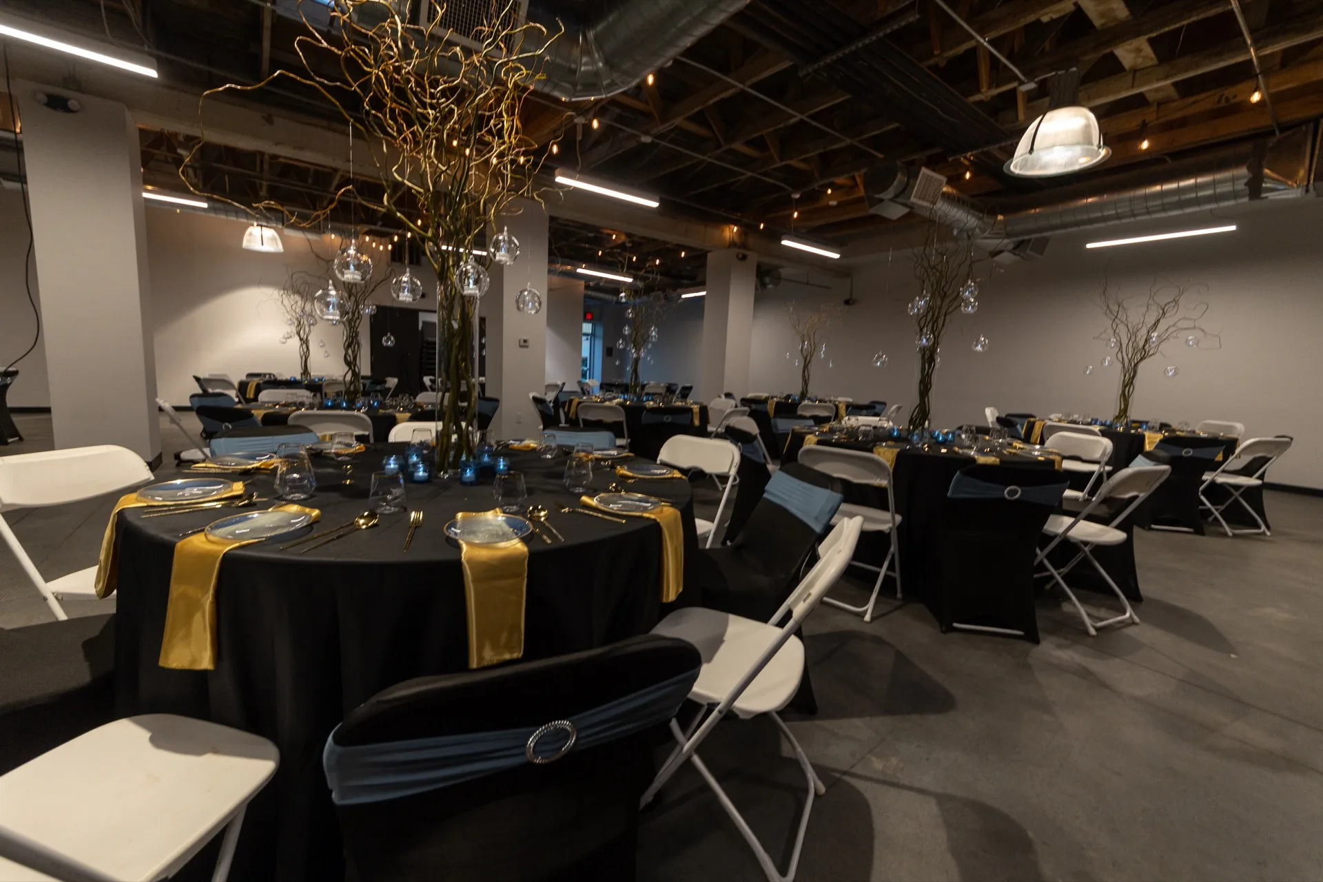
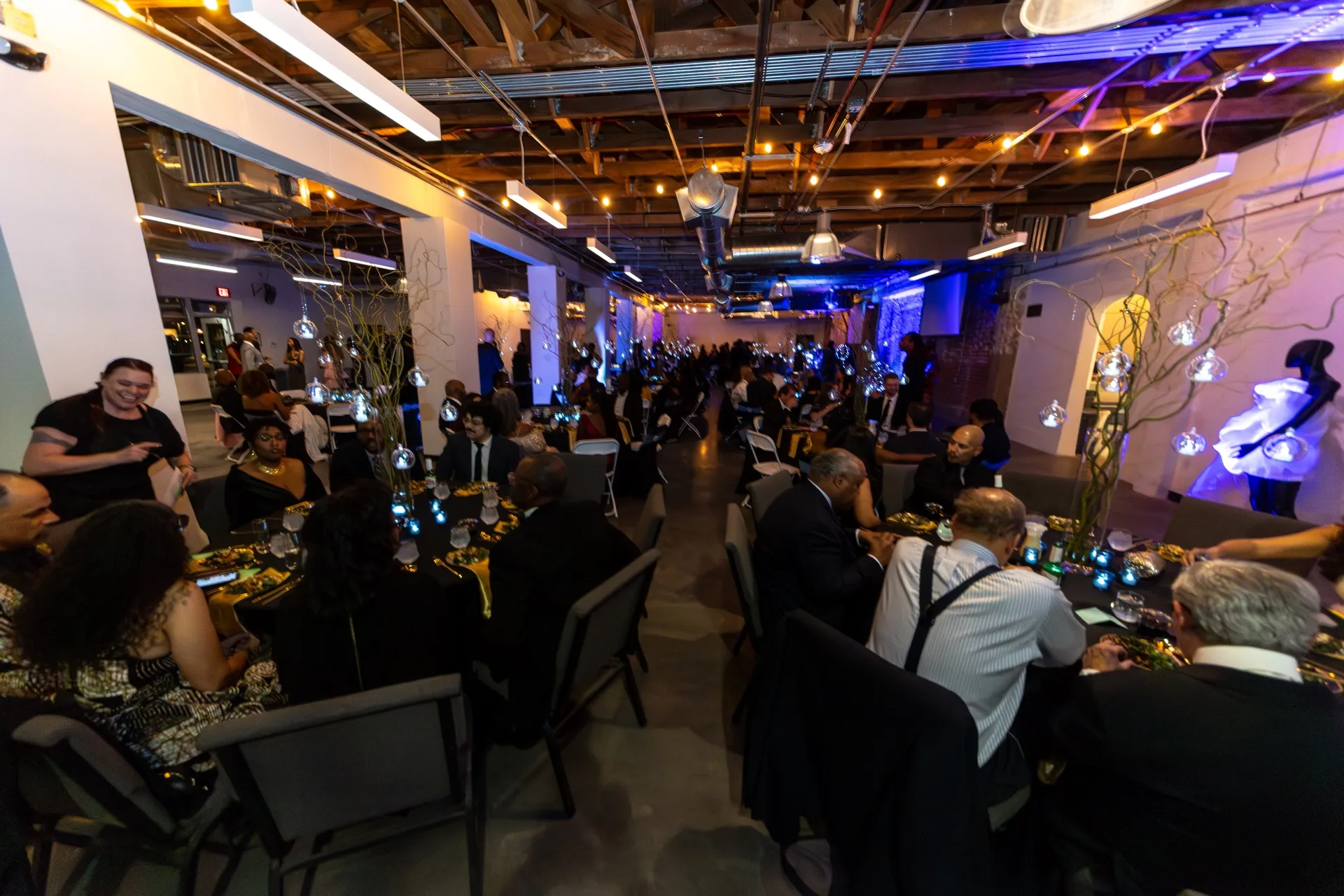
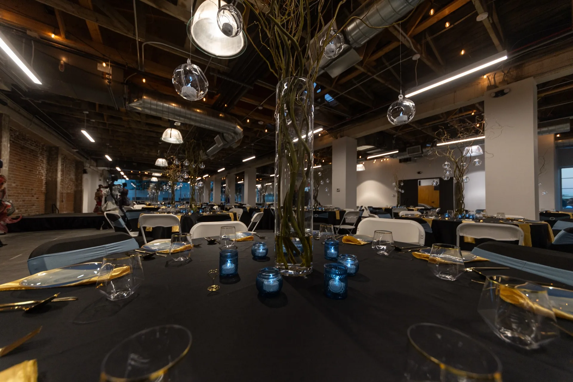
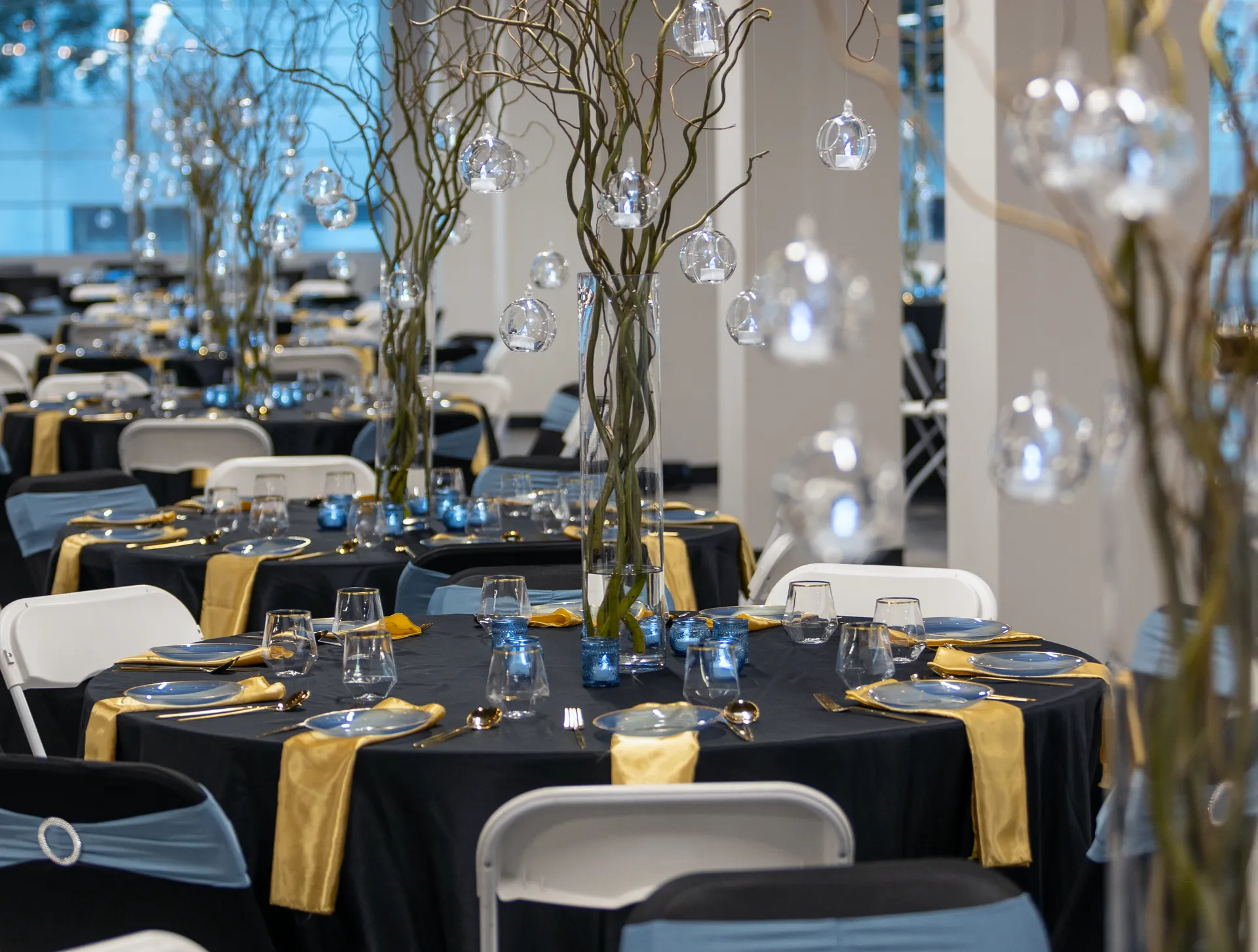
Corporate event decor reads as a wedding when it borrows a wedding's specific playbook: centerpieces built for romance instead of sightlines, a pastel or blush palette instead of a deliberate color story, round tables set in even symmetry with no architectural moment, & soft florals carrying the whole room instead of lighting & structure. The fix starts before a single flower gets ordered. Lock the lighting plan & one architectural element first, keep centerpieces low enough that guests can see & talk across the table, & choose a palette built on a neutral base with one or two deliberate accent tones instead of something soft & romantic.
Where the Wedding Look Sneaks In
Weddings & corporate events are both formal occasions, which is exactly why the two get confused. But they're formal in different directions. A wedding's formality is warm: soft florals, a color story that leans blush or sage or ivory, round tables set close & intimate, candlelight doing most of the emotional work. Corporate formality tends to read as built rather than arranged: a room designed around one idea, with structure & lighting carrying the weight that florals carry at a wedding. When corporate decor leans on the wedding playbook, the cause is usually a default rather than a style failure. Florals & round tables are what most rental catalogs push first, & nobody stopped to ask whether romance was the right register for a room full of a company's executives.
Centerpieces: Scale Is the Tell
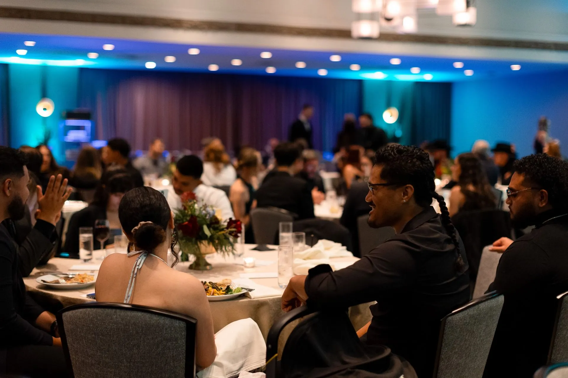
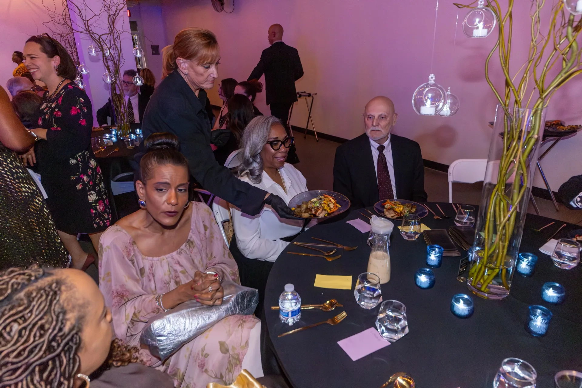
El Ranchito Growers' guide to corporate centerpieces puts it plainly: for seated events, guests must be able to see each other across the table, & a centerpiece that is too tall can obstruct conversation. Its advice is low centerpieces for tables where interaction matters, with taller designs saved for display tables, cocktail areas, or large gala settings, & fragrance kept subtle so it does not clash with food service. A table that piles florals, candles, place cards, menus & favors on top of that starts to look frantic instead of designed, which is its own tell.
The Palette Test
Color does the same signaling work. The Idea Hunter's 2026 design roundup says the most sophisticated corporate palettes are not monochromatic. They layer two or three tones over a strong neutral base. That is a long way from a single soft palette spread evenly across the room, or a wedding's blush-and-sage or ivory-and-gold default. A neutral base with one or two confident accent tones reads as a decision. A soft, evenly blended palette reads as a default nobody pushed back on.
Architecture Beats Florals
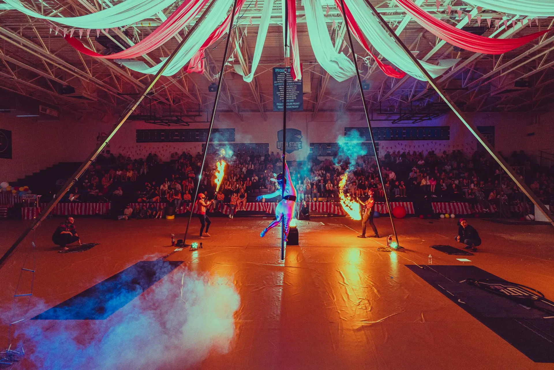
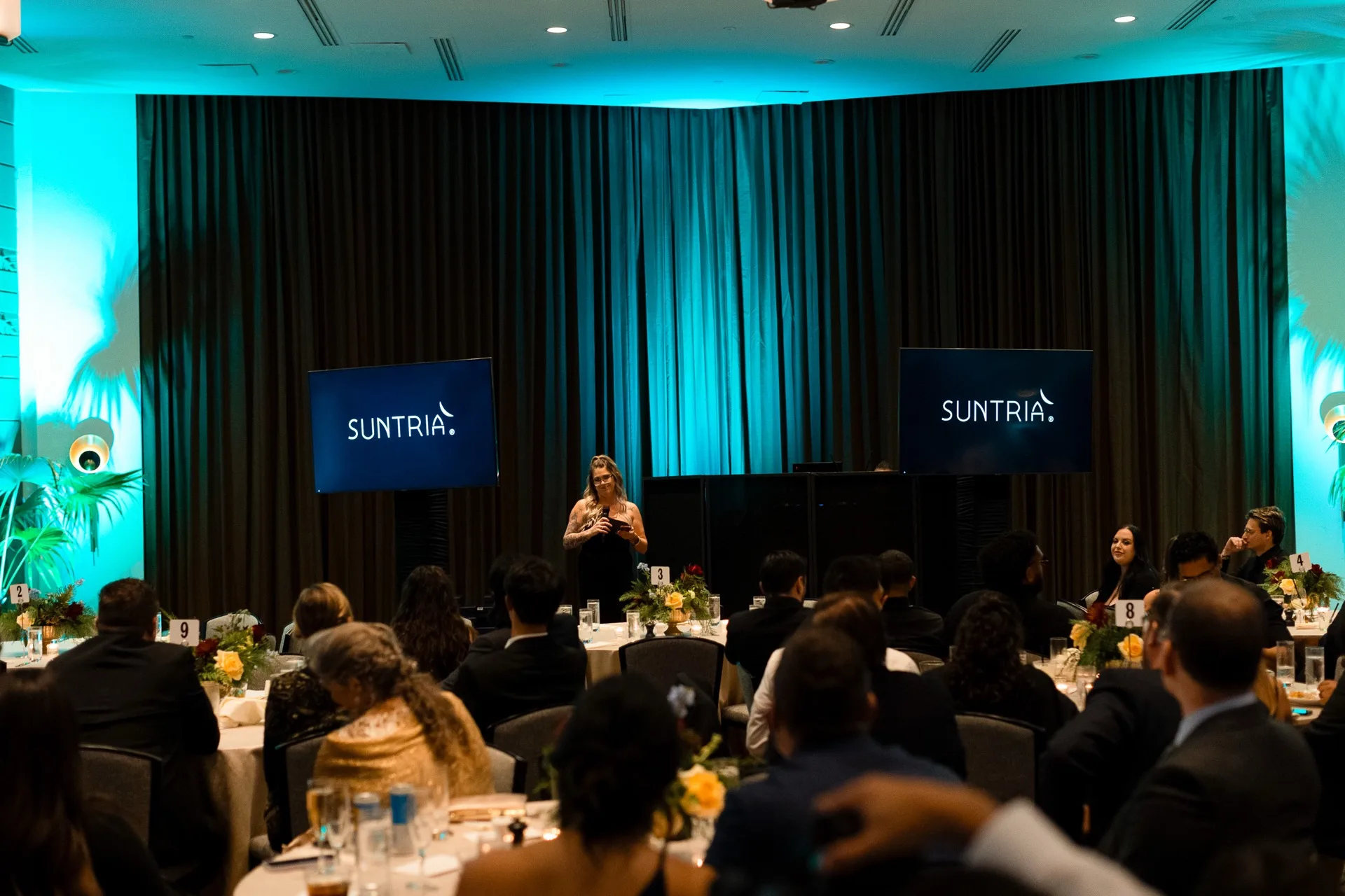
The other tell is what's actually holding the room's structure. The Idea Hunter's read on 2026 corporate design names architectural draping as the biggest decor trend in corporate events: fabric used as a structural element that changes how a space feels the moment guests enter, with the aesthetic borrowed from luxury fashion brands' retail events. A room with one strong architectural moment, whether that's draping, a built backdrop, or a lighting structure, reads as designed on purpose. A room where florals are doing all the work because nothing else got built reads as decorated, & decorated is the wedding word.
Linens Are Where Formality Actually Lives
Linens are the quiet signal most planners miss. Curated Linen Collection's guide draws the same split: weddings often benefit from soft, elegant fabrics, while corporate events may require clean, modern designs. A full floor-length drop in a soft, romantic fabric on every table is a wedding cue even if nothing else in the room says so. Clean lines & a tighter formality register say the opposite.
A corporate room doesn't have to feel cold. The choices just get made on purpose instead of defaulting to whatever the rental catalog leads with. Tell us what the room needs to say about the people in it & we'll build the decor plan around that, starting with lighting & structure before a single centerpiece gets ordered.
Questions planners ask us
Why does my corporate event decor look like a wedding?
Usually because it borrows a wedding's default choices: tall romantic centerpieces, a soft or blush palette, even round-table symmetry, & florals doing all the visual work instead of lighting or structure. None of those are wrong on their own. Together, they read as the wrong occasion.
How tall should centerpieces be at a corporate event?
Low enough that guests can see & talk across the table. Taller arrangements can obstruct conversation, so they work better on display tables, in cocktail areas, or in large gala settings, where they read as built for the room instead of built for a wedding photo.
What color palette reads as corporate instead of wedding-style?
A neutral base with one or two deliberate accent tones, layered textures & metallics. A palette spread evenly across several soft, blended tones like blush, sage & ivory reads as a wedding default.
Do corporate events need floral centerpieces at all?
Corporate events don't need floral centerpieces. Architectural elements like draping, built backdrops, or a strong lighting design can carry a room's formality on their own, with florals playing a smaller supporting role instead of doing all the work.
New posts, straight to your inbox.
Real lessons from real corporate events, no filler.


-1920w.jpg)

-1920w.jpg)